Website developmet for the building cottage Eko-oksamit.com.ua
Task:
The old website should be replaced by totally new one. It has to consist of content types that differs from each other much. We need to do that in a perfect way and to do that really fast.
Solution:
Firstly, we made a content and competitors analysis. Than we developed in a short period because the building company has a hot dead line before starting sales activities.
In order to do the task we made the website with a nifty and saucy pattern of UI/UX.
Our dignified approach was great as the convertion rate of the website rose in 200% in a comparison to the old one.
Project type:
Project status:
Ready
Languages:
RU, UA
Thematics:
Retail
Technologies:
The series of a visual elements along the whole website could bring the peculiarities and brand recognition on oversaturated market of real estate. The main thing is to bring the idea of uniqueness and stay stacked in a minds of potential clients.
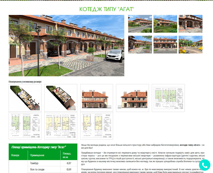
On the page of a certain house a visitor can read carefully the technical characteristics of a real estate and other details of a house.
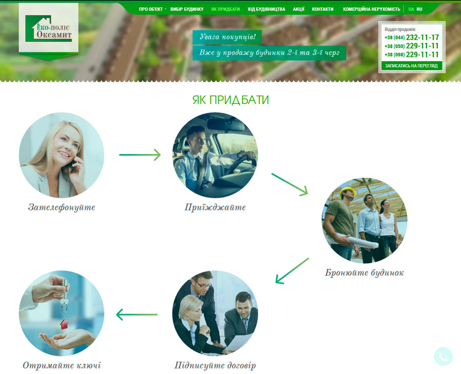
The separate category in a website became the section "How to buy". There places the visual steps of a legal and transparent ways of buying the house.
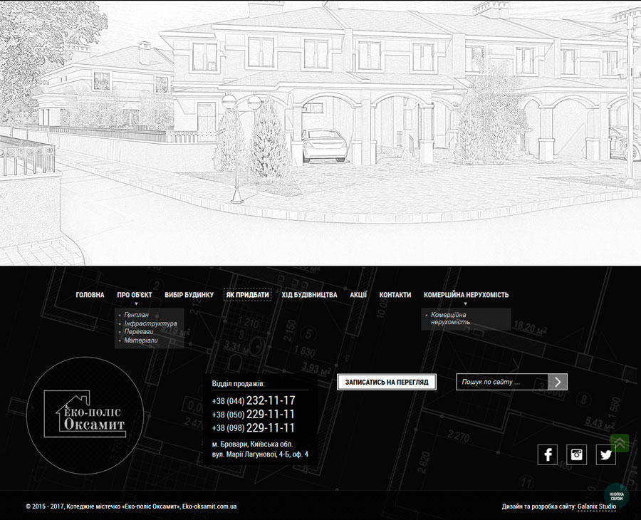
The hand-drawing sketch of a house is situated at the bottom of a page. Such an element complements the inner set and pushed to became the owner of illustrated house.


